Polygenic Scores Explained
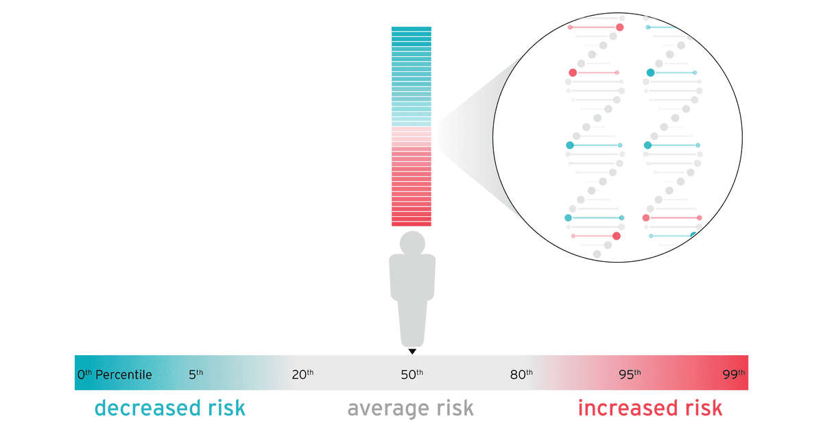
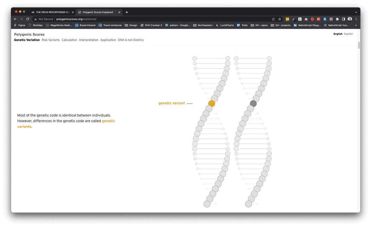
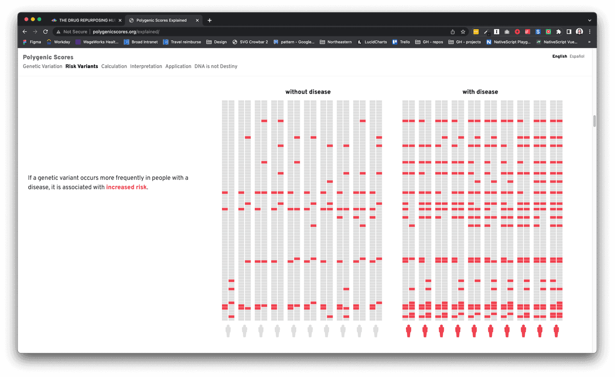
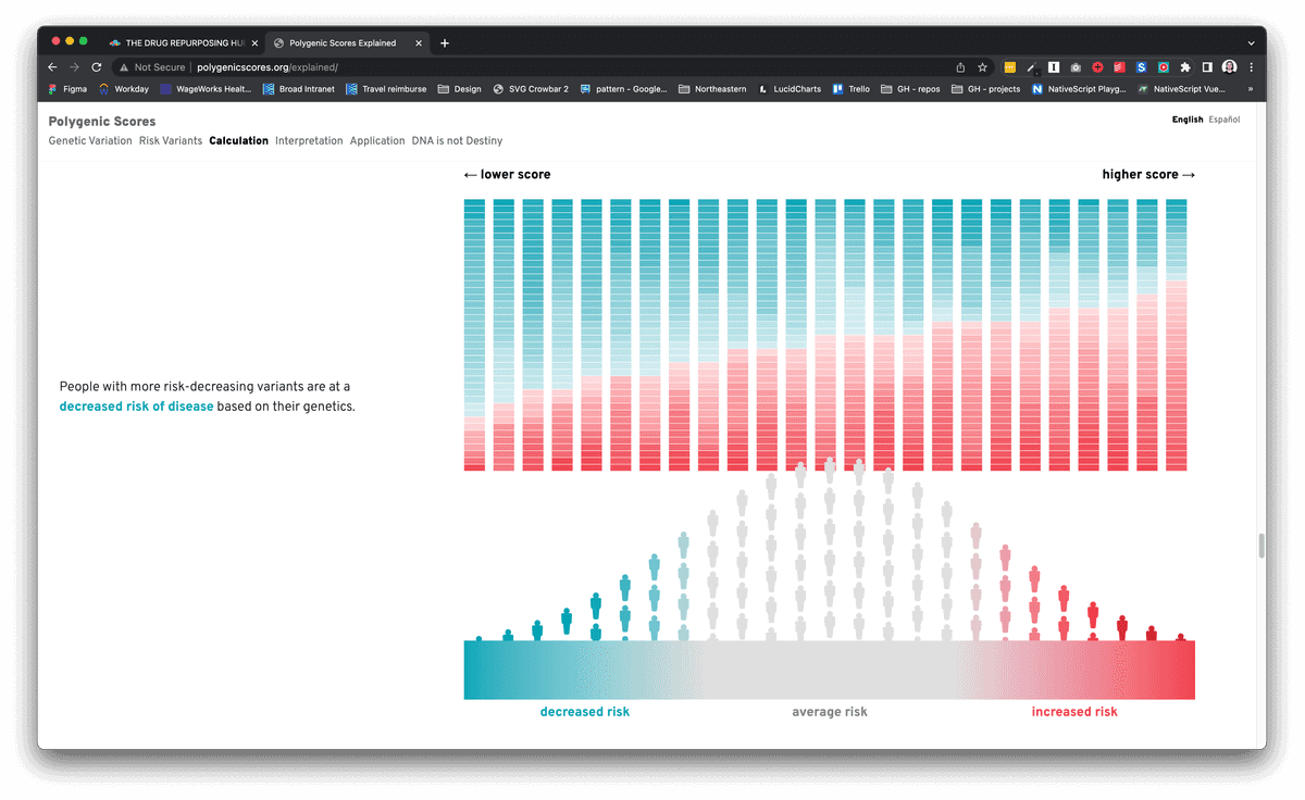
A person's relative risk of developing coronary artery disease can now be read from their DNA, but the challenge lies in communicating these tools to the patients they serve. To improve genetic risk communication and support non-genetics clinicians and patients as they return and receive polygenic scores, we designed and developed a new polygenic score report and a supplemental web-based resource that utilizes scroll-based visualization techniques to provide a step-by-step explanation for understanding and interpreting polygenic scores.
Visit project


