

Pattern is a small team focused on bringing novel data visualization capabilities to scientific collaborators across the Broad.
We are exploring ways to combine high performance web-based rendering techniques with intuitive interaction design, enabling scientists to explore and tell stories about their data.
Please get in touch with us if you have a data set or story that you think might benefit from a customized, outside-of-the-box visualization solution.
Example prototypes
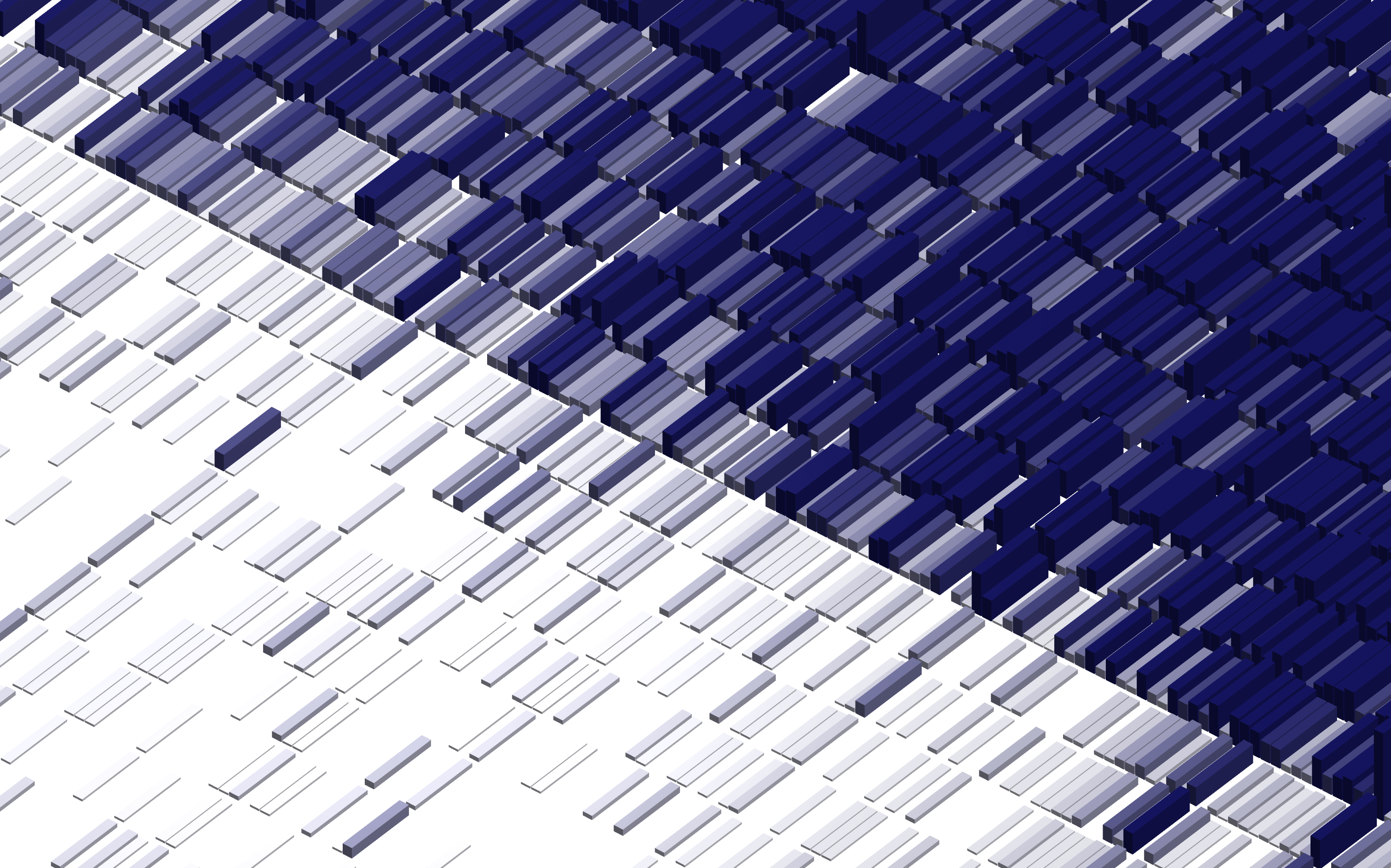
Below are example images from our interactive demo site. The demo site contains a collection of prototypes demonstrating the capabilities we are developing as part of our custom visualization platform. They are designed to spark ideas - let us know if any of them resonate.


Highlighted projects
These projects highlight recent collaborations with teams across the Broad and demonstrate our approach to visualizing and communicating data in a variety of different contexts.


C3PO Visualization Demo
A visualization of cellular programs
Working with Yajit Jain and collaborators, we produced an interactive demo visualization of cellular program data generated by the C3PO system in support of his 2025 Broad Retreat talk, Toward a comprehensive catalog of cellular programs. The demo allows users to explore program definitions and the relationship between program and cell features through dynamically linked heatmap and UMAP visualizations.
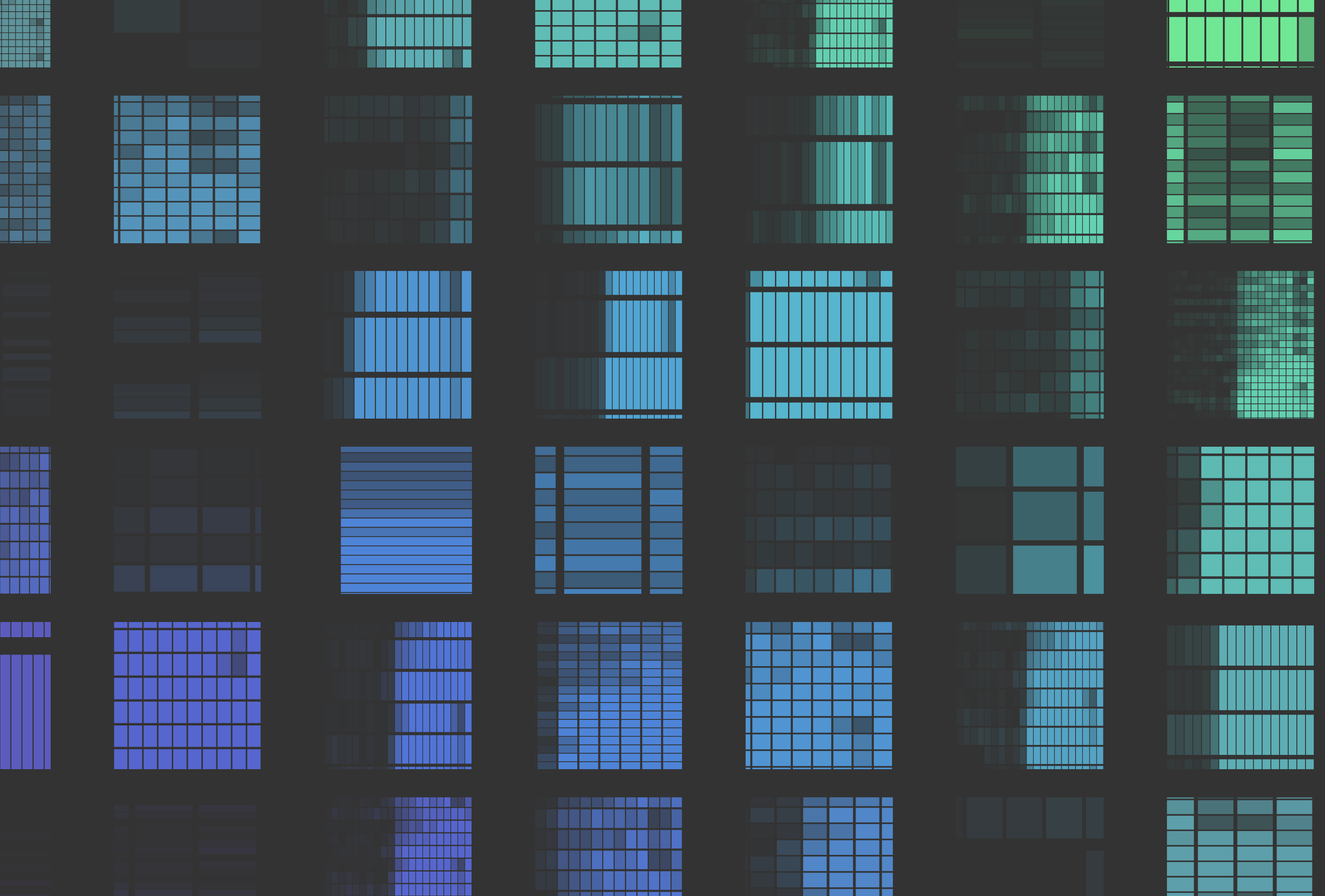
C3PO Visualization Demo — Screenshots


Publication Visualization
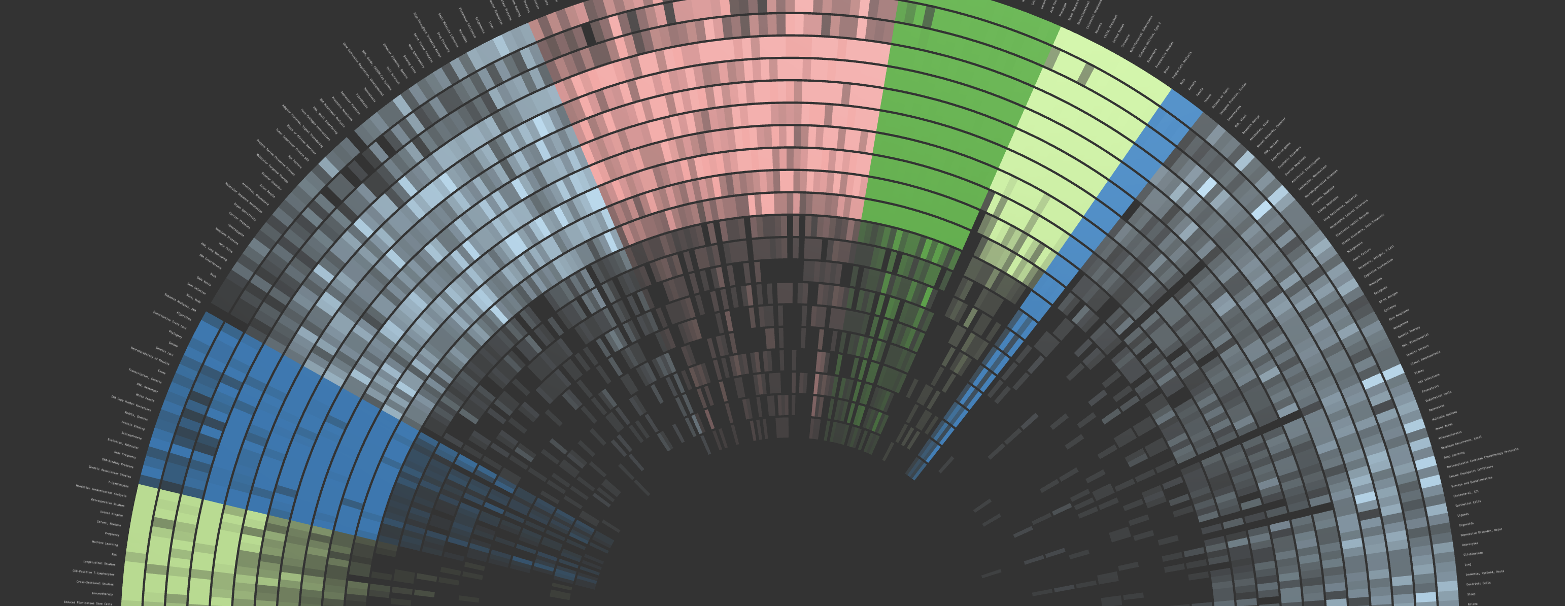
A visualization of 20 years of Broad-affiliated publications through the lens of MeSH terms
For the Broad's 20th anniversary, we produced an interactive visualization representing the papers published by affiliated authors since 2004 through the lens of MeSH terms. This provides a rough representation of the scientific topics the Broad has contributed to over the years. Working with the Communications department, we overlayed the visualization with a storyline highlighting how collections of topics roll up to important domains of Broad science.
Publication Visualization — Screenshots


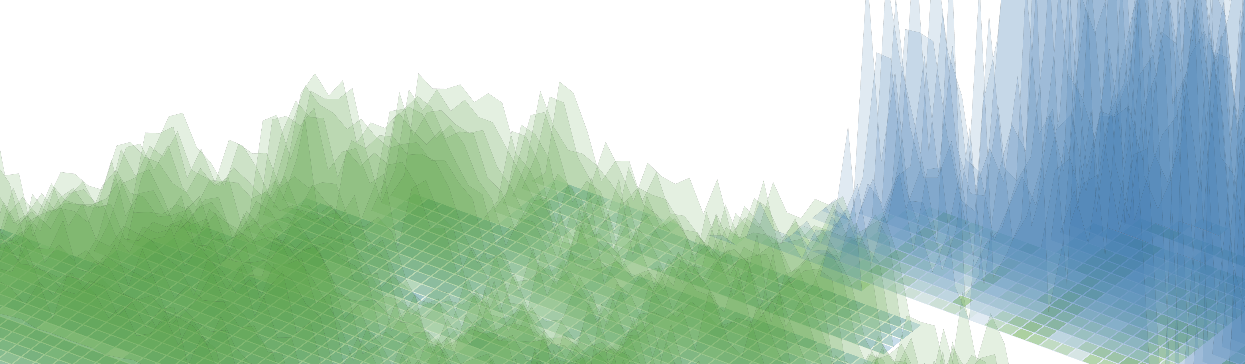
Exploring multi-dimensional drug response data with axis-aligned heatmaps
An interactive tool for interrogating drug response, knockout effects, and subtype context to uncover shared patterns across cell lines.
In this project, we aligned drug dosage heatmaps with knockout and subtype annotations to explore whether dose level sensitivity reveals meaningful biological patterns in cell lines. While the area under the curve (AUC) provides a single summary value, mid-range doses may better capture variation in sensitivity. Subtype annotations are shown for context. Users can reorder rows and columns, zoom, and filter to explore the heatmaps.


